
Man vs Ageing
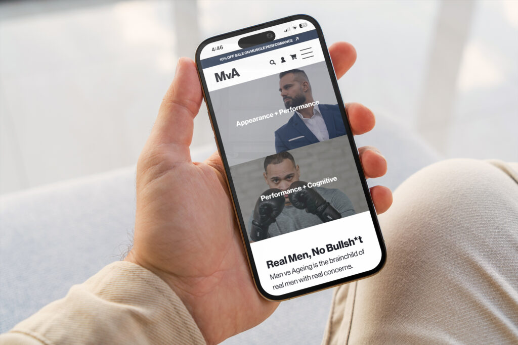
A refined brand and website redesign focused on simplifying the customer journey.
Website Design ✦ UX/UI
Project Overview
Industry: Health / eCommerce
Scope: Website design, UX/UI
Man vs. Ageing was intended as a male-focused extension of the AS Wellness offering.
At the time, the concept lacked clarity, making it difficult to translate into a cohesive digital experience.
Challenges:
Missing key information around how the service worked
No clear onboarding or user journey
Gaps in content and structure
Need to define direction before refining design
The Approach
Rather than layering visuals onto an unclear foundation, the focus was on structure first.
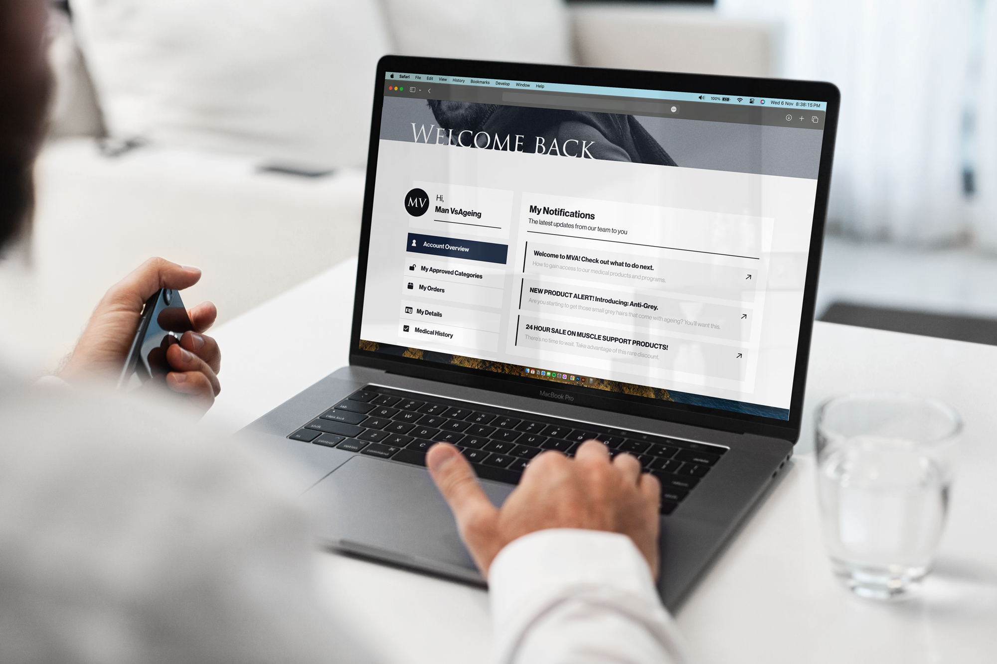
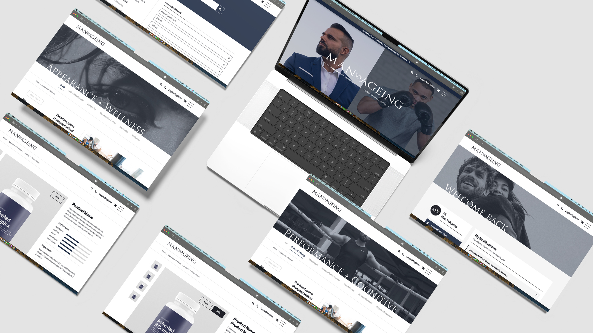
Key pathways were mapped out, core sections defined, and the layout designed to guide users through the experience, even as the business itself was still evolving.
The Outcome
Bringing structure to a brand that didn’t yet have one.
Project Outcome
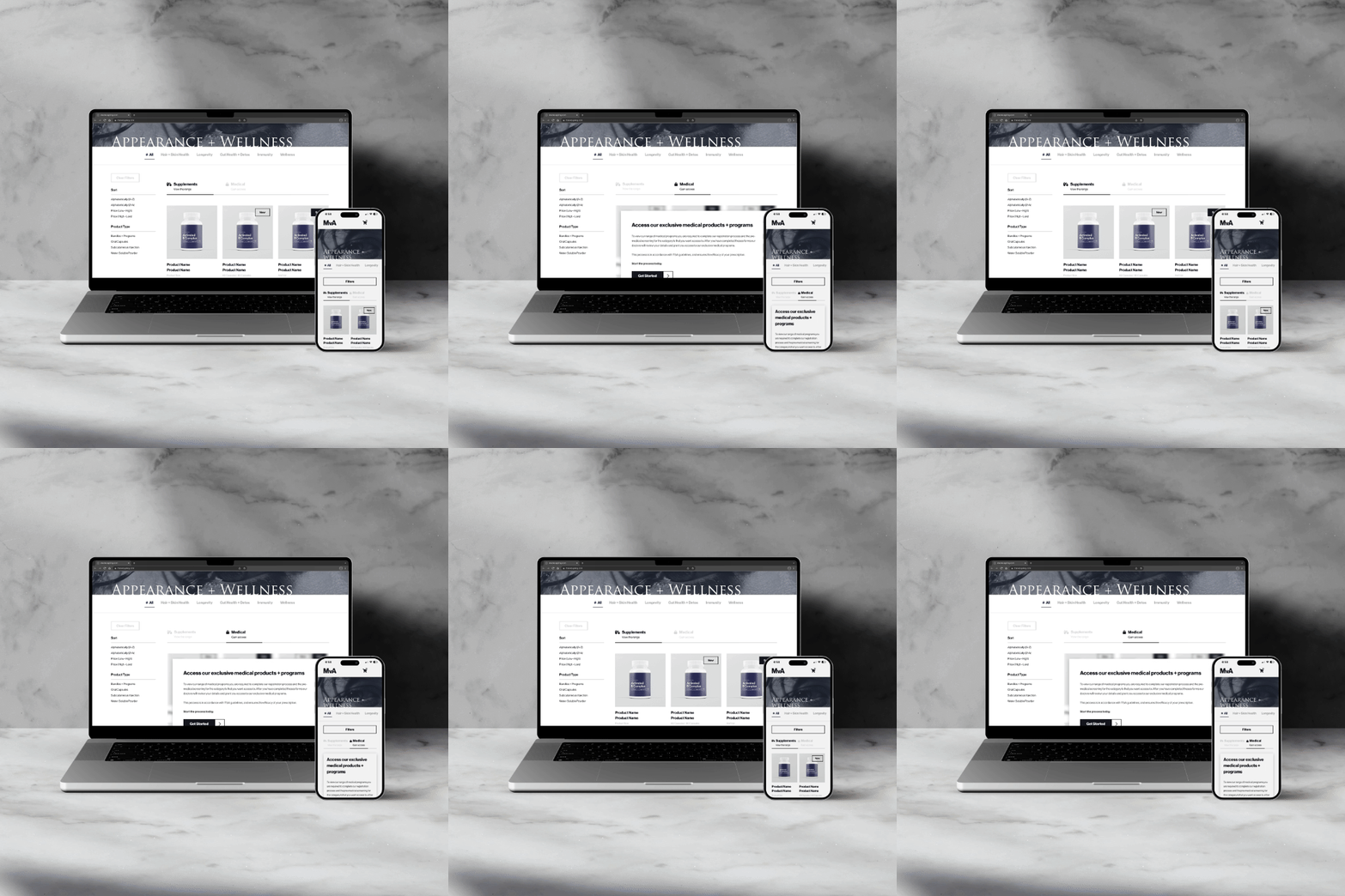
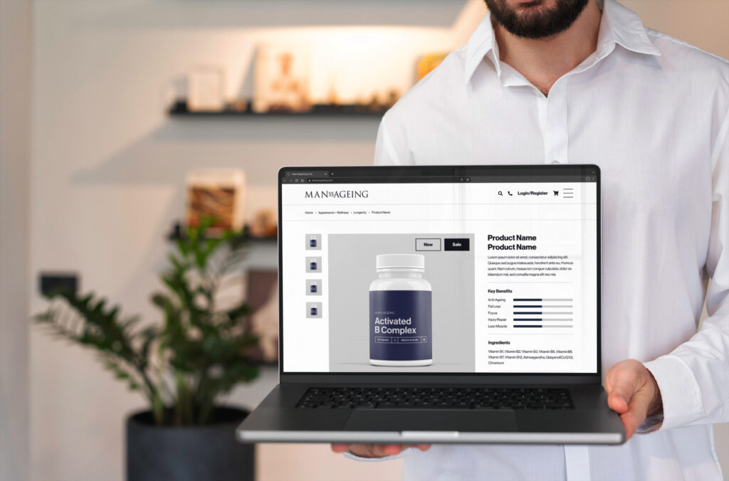
A structured design direction that brings clarity to the concept and creates a foundation for future development.
Impact:
Defined user journey and key pathways
Clearer communication of services and access
Cohesive structure ready for build and launch

Let's create something aligned
Thinking about your own project?
If you’re looking for a thoughtful, structured approach to your brand or website, I’d love to hear what you’re building.
Start a project